Easier Isn't Always Better
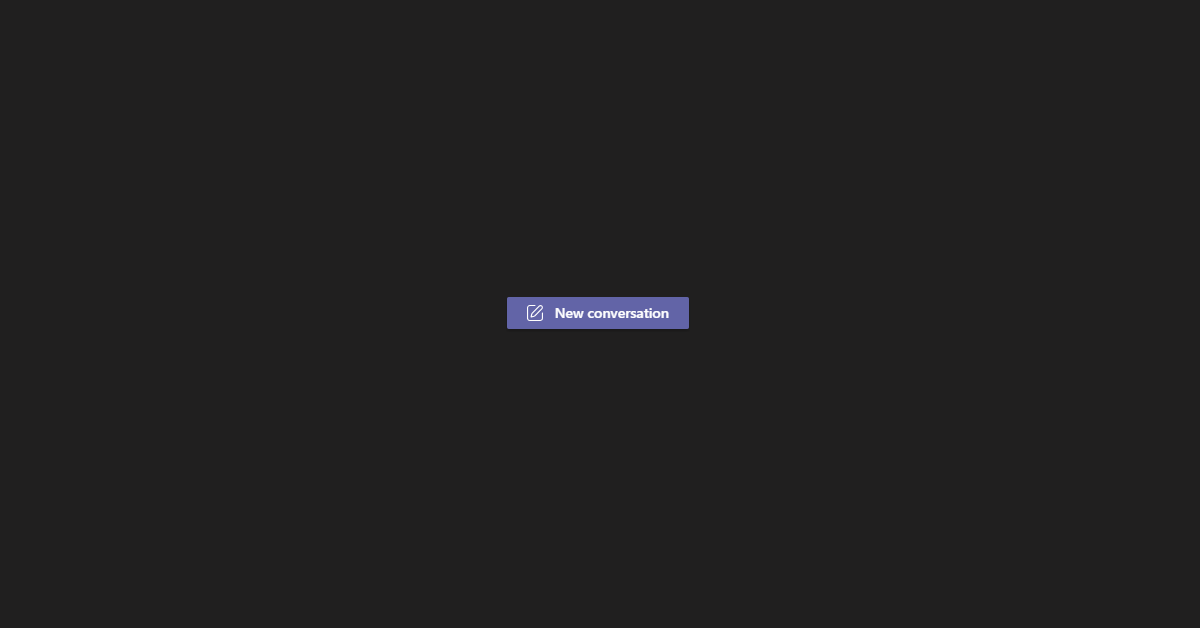
Like many other desk workers around the world, I now perform my work from home. After however many months of social distancing the office seems like a distant memory, and the vast majority of my interaction with my colleagues is online. At the heart of this for me is the group chatting and collaboration tool Microsoft Teams, which I’ve now been using for some time - even before the pandemic. There are a lot of these tools out there and they all have slight differences, but a recent change in the Teams UI caught my attention. Teams has a concept of… well, Teams (the naming isn’t the greatest), essentially groups of people within an organisation. You can then form “channels” within that team, and within the channel you can start a “conversation” - a starting post, that other users then directly reply to. Until recently, creating a new conversation was done the same way as sending a chat message - type it out and hit enter. However there is now a button with the words “New Conversation”, that you must click to reveal the interface for starting a new conversation. At first glance this seems like an unnecessary extra step, especially given it’s been deliberately added - but there is more to this than meets the eye.
Why Add the Extra Step?
One of the standout reasons I can see for this change is increasing the distinction between a channel and a chat. The features are very similar (multi-user instant messaging), but their intent is different. A chat between users seems intended as a loosely defined, long running message channel. You might for example, have a chat that includes all the software developers in the company - the messages may not directly relate to the business, and instead stand to capture incidental conversation. Channels within a team in contrast would have a specific focus - a given product for example. Because users are encouraged (now) to reply to top level messages within that channel, it means the conversations remain focused on specific things - such as a production incident.
Personally before this change I experienced a lot of issues in channels with users talking at different levels. Conversations would be attempted by creating multiple top-level messages as if it was a chat channel, with some users then replying to those looser top-level conversations, which would then be lost as other users pushed them into the history by posting one-off top-level messages. What should carry a neat hierarchy of conversation then ends up as multiple disjointed replies and responses, with lots of tagging specific users to get their attention in a way that shouldn’t be necessary. All because creating a new top-level message was achieved in a single step.
Why Did it Happen
I think this confusion stemmed from a classic problem - the internal development team not seeing the tool through the eyes of a user. When you understand what the code is doing under the hood, and what the intention of a tool is, it seems blindingly obvious how it should be used. As the saying goes though, “The path to hell is paved with good intentions”. It’s not really about users being stupid - it’s that the expectations of the experience don’t match the reality. This is compounded by users having been trained on other tools throughout their lives. Even if you’re not an IT professional who has used things like Slack or IRC before, most everyone has messaging apps in their lives.
And this comes to the other issue - how our current situation (if you’re reading this in the future, if there is one, I’m talking about the 2020 pandemic) has taken what could be seen as a niche tool that can be worked around, to an indispensable part of working life. I actually remember a period when as a department we were encouraged not to use instant messaging in the office, as you could usually get a better conversation out of physically talking to someone. This is just not possible anymore. Compound this with users who might not be as tech literate making heavy use of something they haven’t been working with in their daily life, and it’s the perfect storm for confusion.
The Fallacy of Minimum Clicks
There is an old idea that a way of measuring the effectiveness of a UI is how many clicks it takes to achieve something. I think this stems from the early days of the internet - where every click meant a page load, and every page load was agonisingly long. You’d measure how much people clicked through to achieve a particular bit of functionality, and try and reduce that number. There is one big problem with this that I call “The Magic Button” - that if you follow this aggressively enough, your application becomes a series of obtusely named magic buttons that just “Do the thing”. The problem then becomes that not only do users have to be trained in your application - but maintaining that piece of functionality can become a nightmare.
Understanding Interfaces
In Object Orientated Programming, there is the concept of the interface - not that the users sees, but within the code. This works kind of like a contract for code - if an object (piece of code) implements (is an example of) an interface, it must provide methods (actions) that the interface declares. This can open up lots of different options to a developer that I won’t explain in detail, but at its core allows a developer to trust that something implementing an interface will take care of the action you tell it to do. This allows your code to have single responsibilities and be broken up in sane ways. In a lot of ways, this is the same thing as a user interface - a user interface presents a button, with the implicit trust that clicking the button will do the thing the button says.
In both programming and user interfaces, I’m a big advocate for many small, meaningful actions instead of large “do the thing” blocks of functionality. When you have either kind of interface hide the complexity of a given action, you are starting to make assumptions for your user. Let’s take the example of creating a user account on a web shop. You could expect a user to fill in every detail at once - their name, email, address, payment details, desired delivery service etc - all before offering any products at all. Likewise, you could do the same in your code - an interface that expects all properties of your user at once. In both cases, breaking up these details into multiple steps allows greater flexibility later, even if you initially do ask your user for all these details at the same time (through a wizard in a user interface, for example).
This feeds back into the idea of splitting your application into meaningful actions. It doesn’t matter so much if a user has to click a lot of times to perform an action - if every click is meaningful. This is why teams added the extra cosmetic step into starting a new conversation within a channel. When you make your user click a button labelled “New Conversation”, it forces that user to think about what they are actually doing. This is because the intent of a conversation in a channel is not to be an off-the-cuff remark, instead to be a focused and relevant chat about the subject at hand. Whilst it might make the process infinitesimally harder for a user who is already thinking this way, to a user that is instead just looking at a channel as another chatting interface it can make all the difference.
As an aside, a book recommendation I always trot out when I’m talking about user interfaces is the fantastic Don’t Make Me Think by Steve Krug. If you’re looking to up your understanding of how users interact with software - be it as a developer, designer, or business person, it’s a great read.